

Company
Pano AI
Role
Design Systems Lead
Tech Stack
React.js, Typescript, CSS, Storybook
Design tools
Figma
CONTEXT
The Problem
Pano detects wildfires in real time using AI-powered camera feeds, helping first responders act faster.
Bridging design and engineering, I unify the system that both teams build from. I also actively investigate how AI, like Anthropic's Code to Canvas integration can accelerate design-engineering collaboration.
When I first stepped in, the design system in the Figma was outdated and out of sync. Figma components didn't match what was in production. Typography, colors, naming conventions, and components were different between the two. I drive alignment across teams and am actively exploring how AI can accelerate design-engineering collaboration.

"I don't trust the Figma components. They're either missing or inaccurate, so I have to check what's live and rebuild from scratch."
— Designer
In addition to that, the Figma file of the design system was disorganized, making it challenging to find the exact component needed.
"The specs I get from Figma, like colors and headings, have completely different names or values in code, so I constantly have to look things up."
— FE Engineer

This created confusion on both sides. Designers might use a component that didn't match production, and engineers couldn't tell if the mismatch was intentional or just outdated. This slowed things down for both teams and meant more back-and-forth during handoffs and QA.
Research
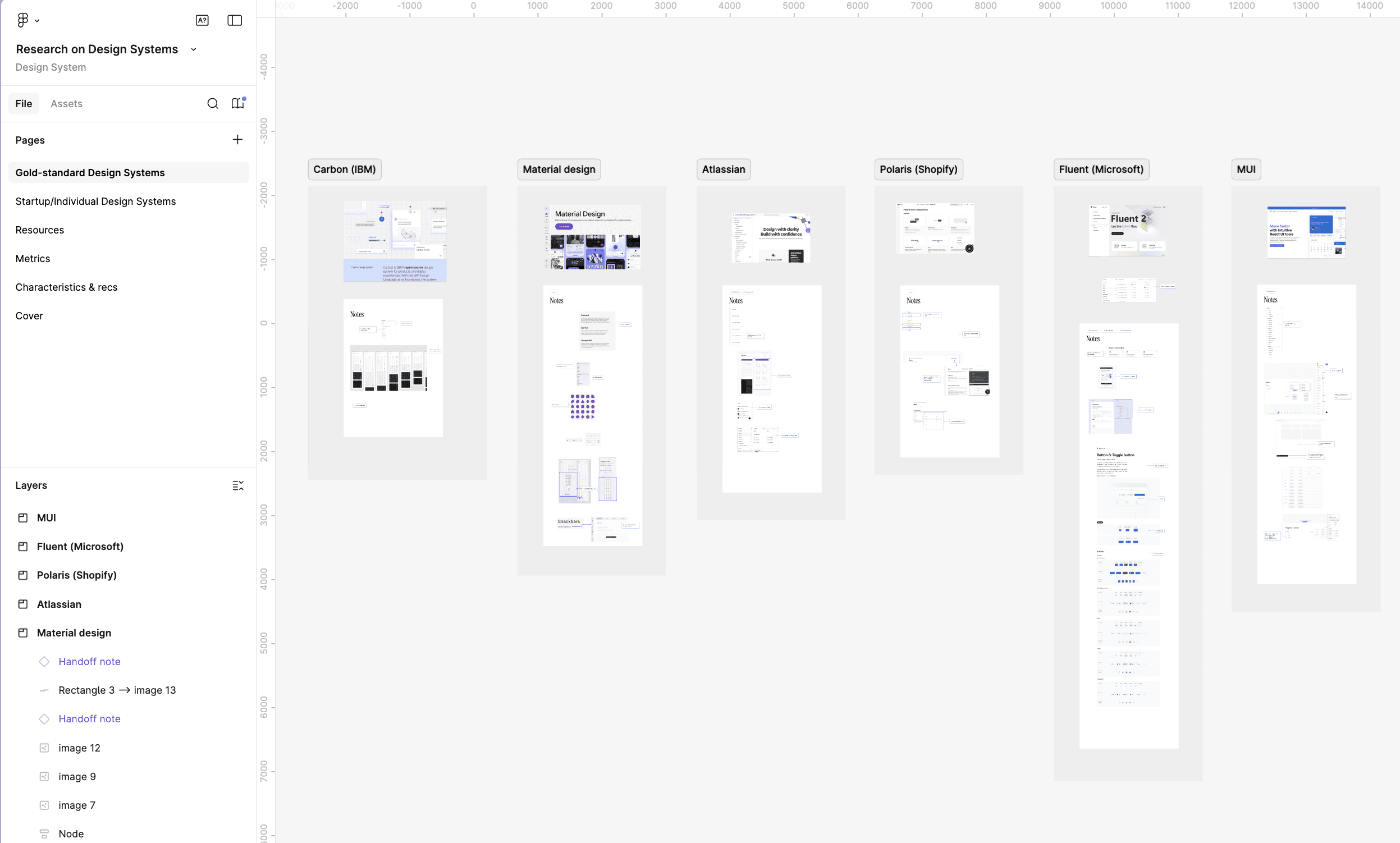
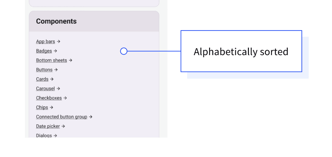
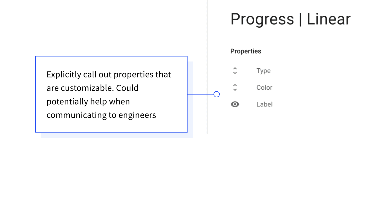
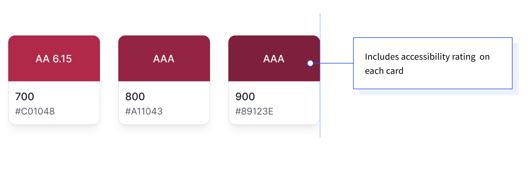
Before making any changes, I audited design systems across the industry to understand how other teams were solving the same problems. I looked at systems like Atlassian, Material Design, and Polaris, as well as community UI kits on Figma. I also pulled from online resources like DesignSystems.one, conference talks from Config, and documentation from teams like Spotify's design system. I took note of how they named colors, organized their file structures, and showcased component variants.
From there, I developed recommendations tailored to our team size and design system maturity. This included covering how to organize the Figma file, our implementation approach, and a strategy for what to tackle next.
Typography
The type styles in Figma didn't match what was in production. Heading sizes, line heights, paragraph spacing, and letter spacing were all different between design and code.
Example one: headings
Heading sizes and weights in Figma were completely different from what was in the codebase. For example, Figma's H1 was 40px semibold, while the code rendered H1 at 96px regular. H3 in Figma was 28px, a font-size that the codebase didn't even have. Figma had 5 headings, the code had 6.

In addition, h5 and h6 in production had inconsistent font weights, with a mix of semibold and regular. I used Claude Code to get metrics on the frequency of each weight.
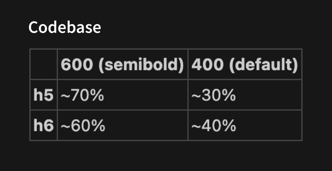
I did a visual audit and drove alignment with the design team to standardize on semibold for both h5 and h6. The team also aligned on matching Figma's heading font sizes to the codebase. I updated the type scale in Figma and changed the font-weight for h5 and h6 in code.
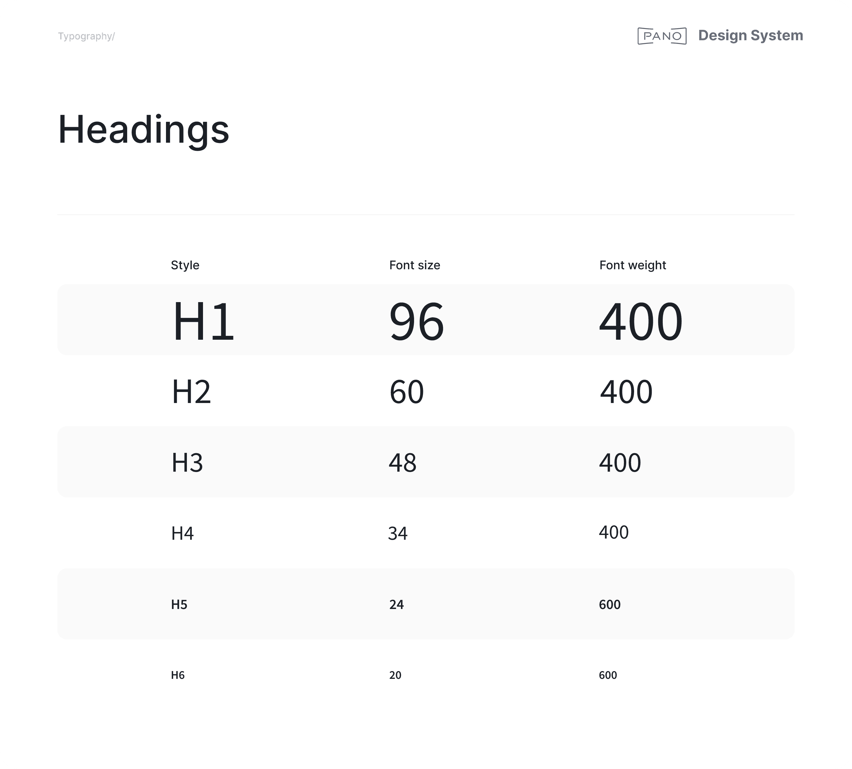
Now, heading styles are perfectly consistent across design and code.
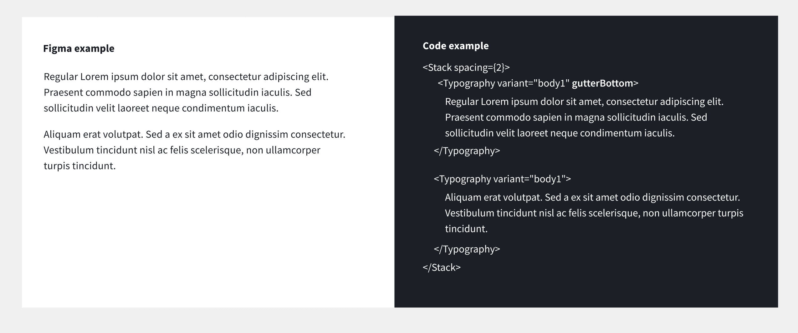
Example two: paragraph spacing
Paragraph spacing in Figma didn't match what the code was rendering, so I updated it in Figma to align.
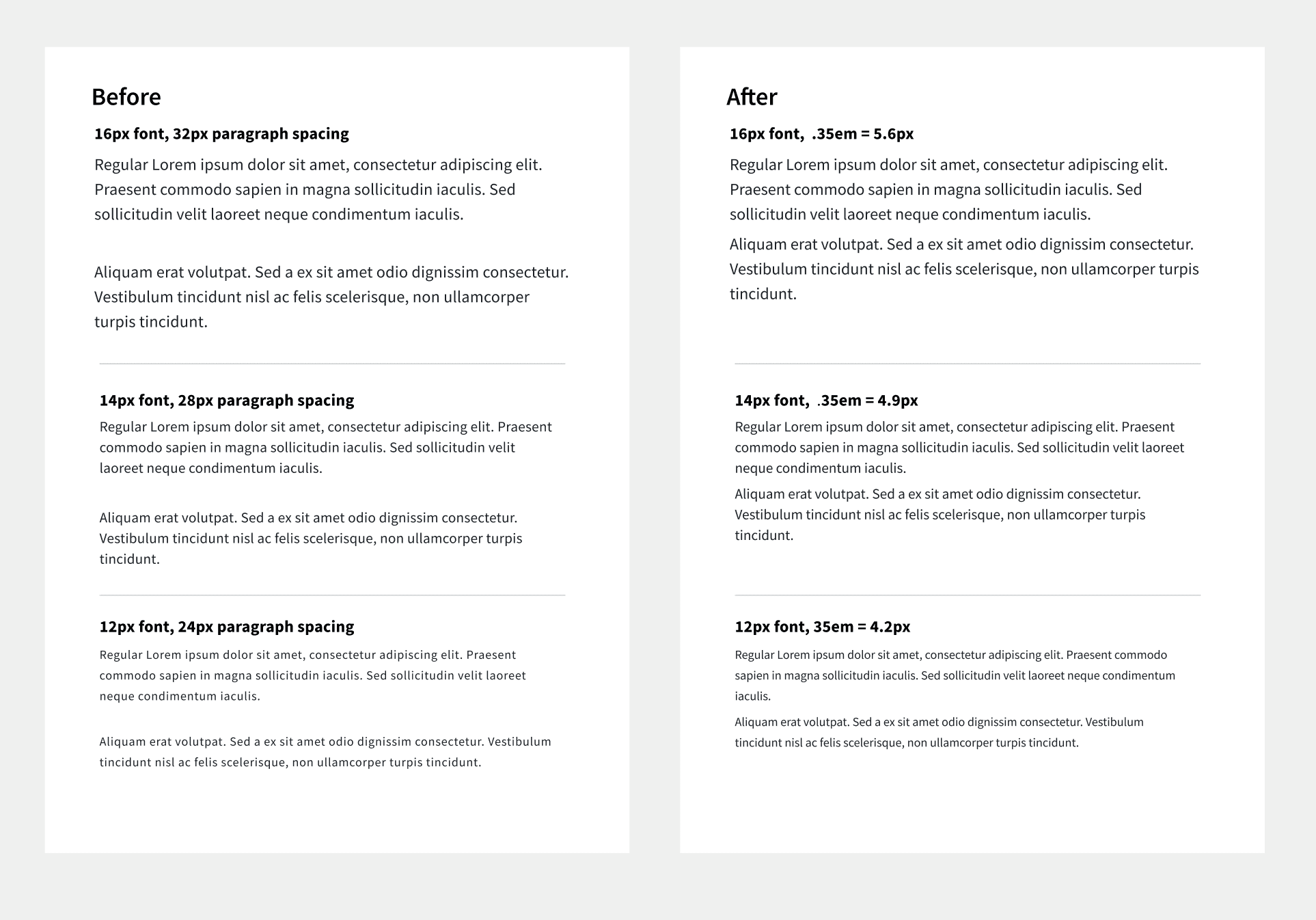
Now the paragraph spacing matches MUI's gutterBottom property.
Example two: paragraph spacing
Paragraph spacing in Figma didn't match what the code was rendering, so I updated it in Figma to align.
Now the paragraph spacing matches MUI's gutterBottom property.
Example three: paragraph naming
[might remove this]

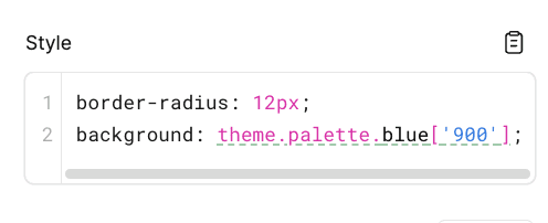
Colors
Color names in Figma and the codebase didn't match, and Figma was missing colors that existed in code.

On the code side, naming was also inconsistent and unscalable.
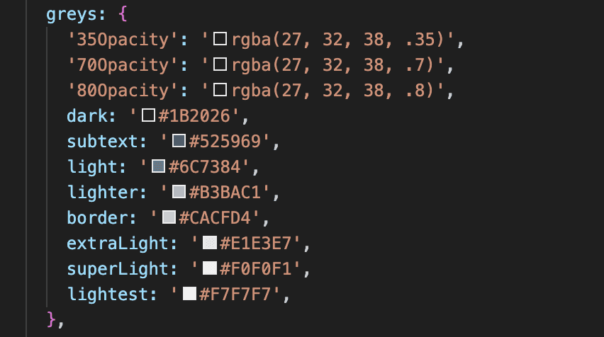
I proposed a new color scale to designers and engineers, replacing custom names with a numbered system (e.g. gray.900, gray.800), keeping MUI's default variable names (e.g primary.main, primary.dark), and removing extra custom ones. To get more detailed feedback, I put up a draft PR for engineers to review the new theme and shared updates in Figma for designers.
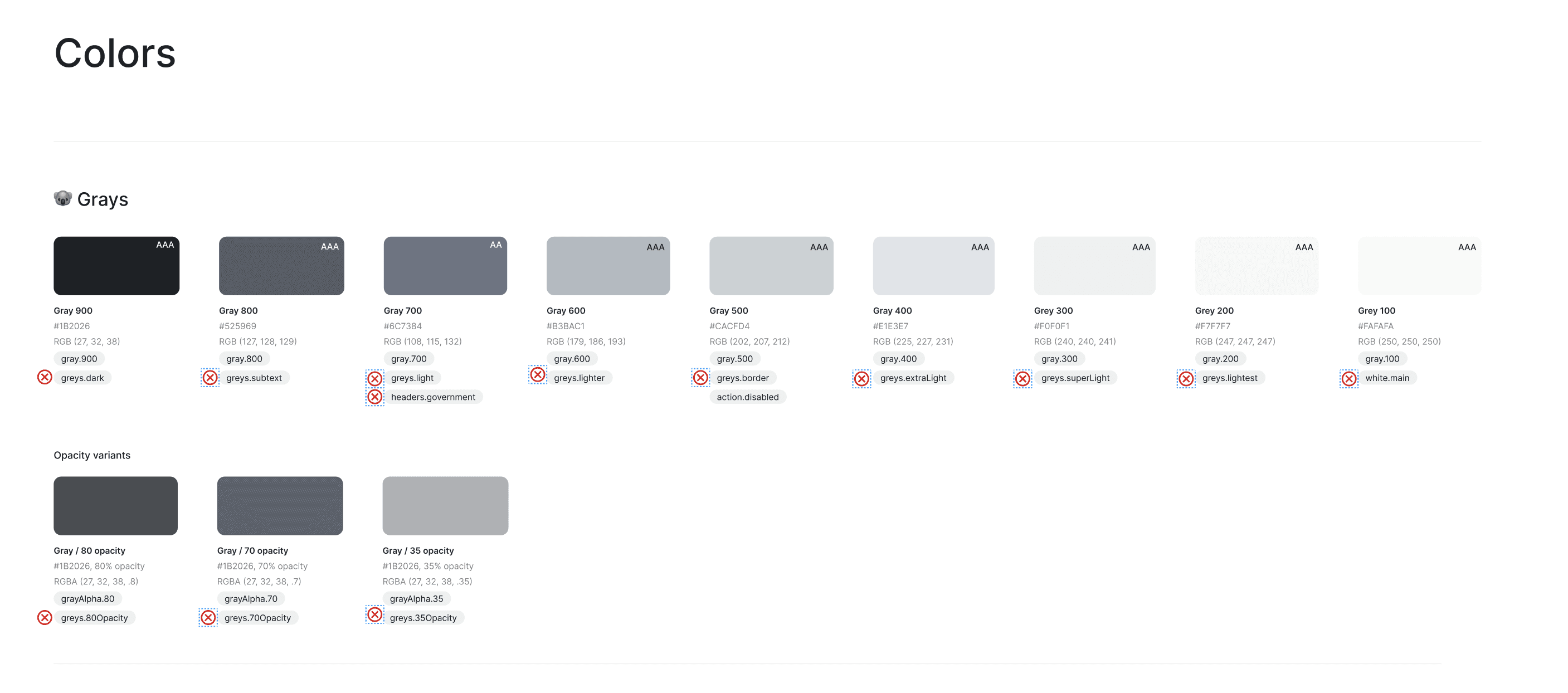
I then migrated the colors to the new names in both the Figma design system and the codebase. The design team also aligned on needing a new green shade for success states, which I also added to the Figma and code.
Now, the colors in the Figma and code are consistent. If a Figma component is inspected, it shows the same name as the code.
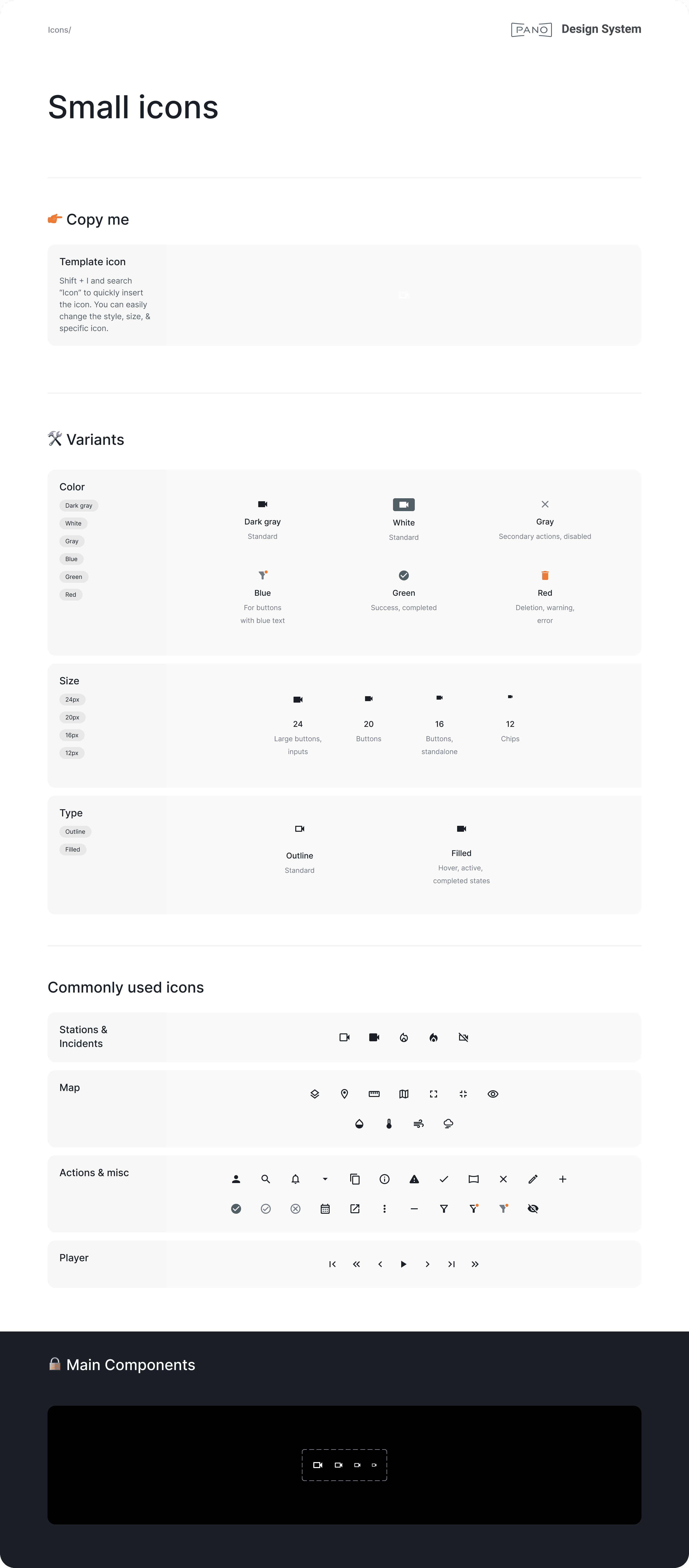
Icons
Icons in Figma were disorganized, with no clear system for variants or usage guidelines. The app also had a mix of outline (just the stroke) and filled (solid) icons with no consistency. I reorganized the icon library, defined variants for color, size, and type, and drove alignment with the design team on conventions, such as using outlined icons by default, and filled for their hover and active states.
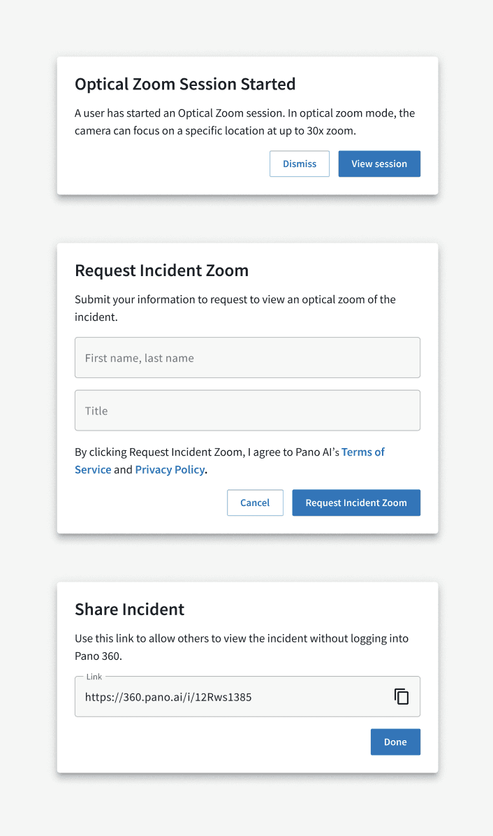
Components
Modals across the app were inconsistent. Padding, margins, and styling all varied from modal to modal, with things like awkwardly placed banners inside them.

I designed a scalable modal component in Figma that covers all use cases, then built a matching component in code and added it to Storybook. It has standardized padding and margins, supports inputs, and allows for flexible button styling. I also migrated the most-used modals in the codebase to use the new component.
What's next
Still on the roadmap: buttons, dropdowns (including sort, filter, and picker variations), and reworking alert banners to pass accessibility requirements.