

Company
HOVER
Role
Staff Product Designer
Team
1 PM, 5 algorithm engineers, 3 mobile engineers, 1 data analyst, 1 UX researcher
Timeline
Alpha-Phase 2 of Beta, ~6 months
01. Context
HOVER generates a 3D model and measurements of a home from a few smartphone photos. Contractors are HOVER’s largest user group, using it to measure homes for exterior renovation projects like roofing and siding.
HOVER wanted to build a new capture experience around a new algorithm and SLAM (Simultaneous Localization and Mapping), the same tech that lets self-driving cars sense their surroundings and track their own position at the same time. This new technology would unlock a major opportunity for contractors: the one-call close.
When a contractor wants to bid on a project, they visit the homeowner and capture the property with HOVER. With the existing experience, they have to wait several hours for the measurements and 3D model to be generated. By then, the contractor is back in the office and has to follow up with the homeowner later to share a quote. The new algorithm could dramatically reduce that turnaround time, allowing contractors to get their measurements while still onsite and potentially win the job in a single visit.

"If I could get my measurements back in 20 minutes, I could give a quote right there instead of following up later."
— Contractor
But the existing capture experience wasn’t compatible with the new algorithm, so I was brought in to design a new one.
Goal
The new algorithm had an important limitation: it couldn't reliably tell users, in real time, which parts of the house they'd already captured or whether their capture would even work. There was skepticism about whether the technology was mature enough to support a good user experience, especially since even the existing capture experience didn't always successfully produce measurements and a model. So leadership set a simple bar: the new experience couldn't feel worse than the original, and its success rate (whether it could actually generate a model and measurements) couldn't get meaningfully worse either.
It also needed to work across HOVER’s primary user groups: contractors, insurance adjusters, and homeowners, who were often using HOVER for the first time.
Role & Timeline
I was the sole designer on the Capture team and owned the experience end-to-end.
There wasn’t a UX researcher on the team during my first four months, so I led that research myself in the meantime. When we brought on a contract researcher, I managed that work as well.
Alpha → 40 pros (contractors & insurance adjusters)
Beta Phase 1 → 500 pros (contractors & adjusters) + 50% of homeowners
Beta Phase 2 → 2,000 pros (contractors & adjusters)
Beta Phase 3 → 20% of all pros (contractors & adjusters)
GA → General availability
02. Alpha Start
To graduate from alpha to beta, the new capture experience needed to perform at least as well as the existing experience. With the current experience, users had to capture at least 9 photos – one for each corner and side.
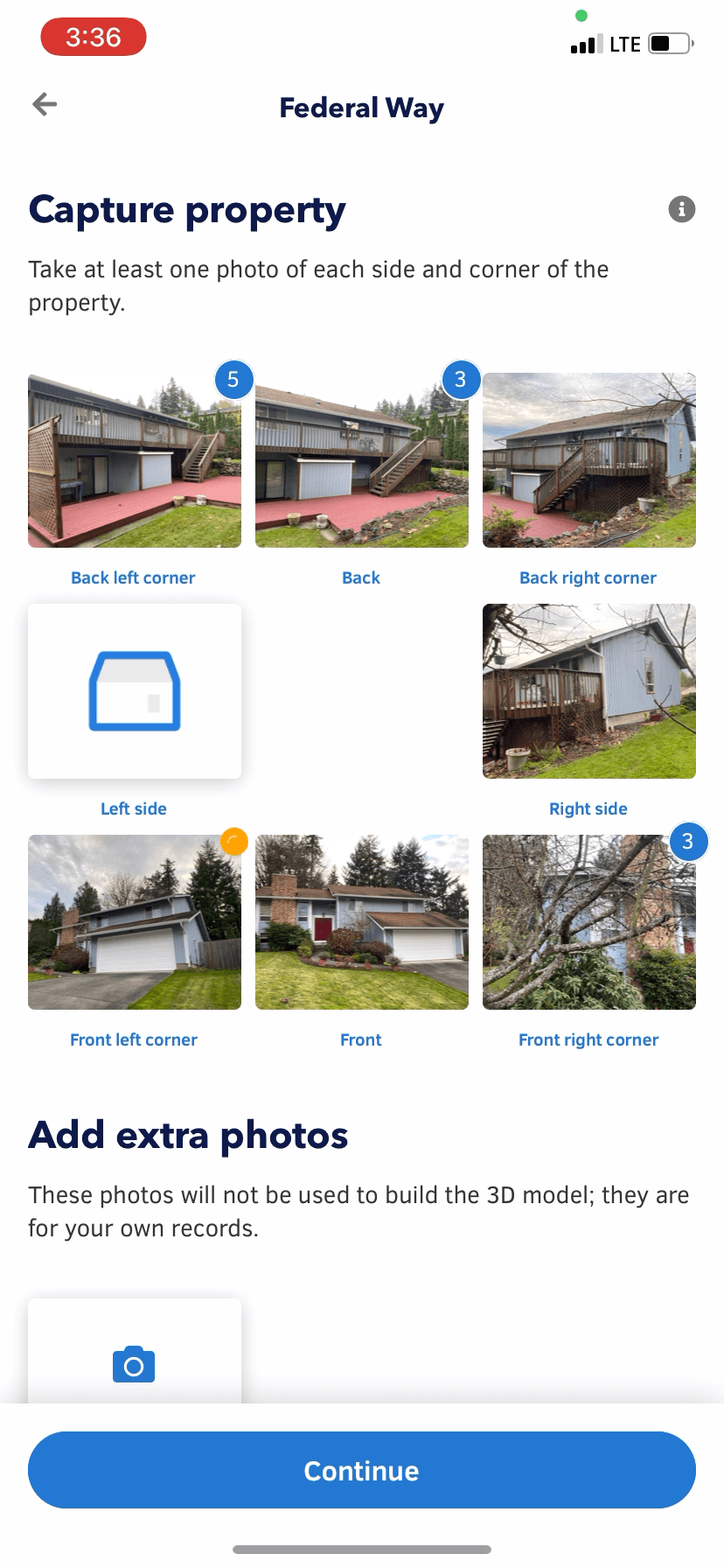
So how could we determine whether a capture experience was actually better or worse?Qualitative research and interviews gave us directional signal, but we also used a standardized usability metric called UMUX-Lite (Usability Metric for User Experience). It’s a two-question survey measuring perceived ease of use and usefulness, which is converted into a score out of 100. We surfaced the survey immediately after users submitted their photos.

We first measured the existing capture experience with contractors and adjusters and established a baseline UMUX-Lite score of 84.9. That became our benchmark for graduating from alpha to beta.
Initial Alpha Starting Point
The new algorithm relied on visual overlap between consecutive photos to stitch them together into an accurate 3D model.
Before I joined, the team had aligned on an initial instruction: walk in a full circle around the property and take a photo every five steps, meant to ensure enough overlap without asking users to understand how the underlying algorithm worked.

Some users didn’t read the instructions, resulting in the algorithm not getting the photos it needed.

There were moments of uncertainty throughout capture: “Is it OK my car’s in the driveway?” “Am I doing this right?”
After capture, homeowners had no idea when they’d get their 3D model and lacked any sense of closure.
How might we educate the user on what to expect post-capture?
How might we remind the user to stay safe?
03. Alpha Iterations
Improvements during Alpha
Now that we better understood the pain points, I started brainstorming ideas. A lot of the ideas we considered weren't feasible given our technical and time constraints.

Our dream vision, rendered with After Effects
Because of that, the direction our team landed on was to instruct users to take overlapping photos, so the algorithm could more easily stitch them together. Designing the usability of this was challenging, since the technology itself was still being built in real time and was novel enough that patents were being filed on it.
Instructions
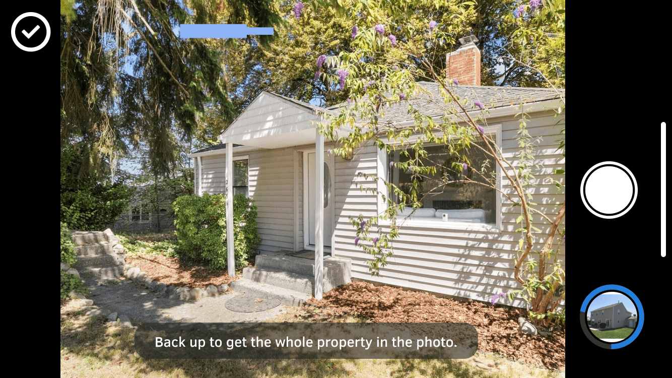
Since some users skipped the tutorial before capture, I added in-camera instructions, so guidance showed up right when people needed it instead of something they had to remember from before they started.

Safety
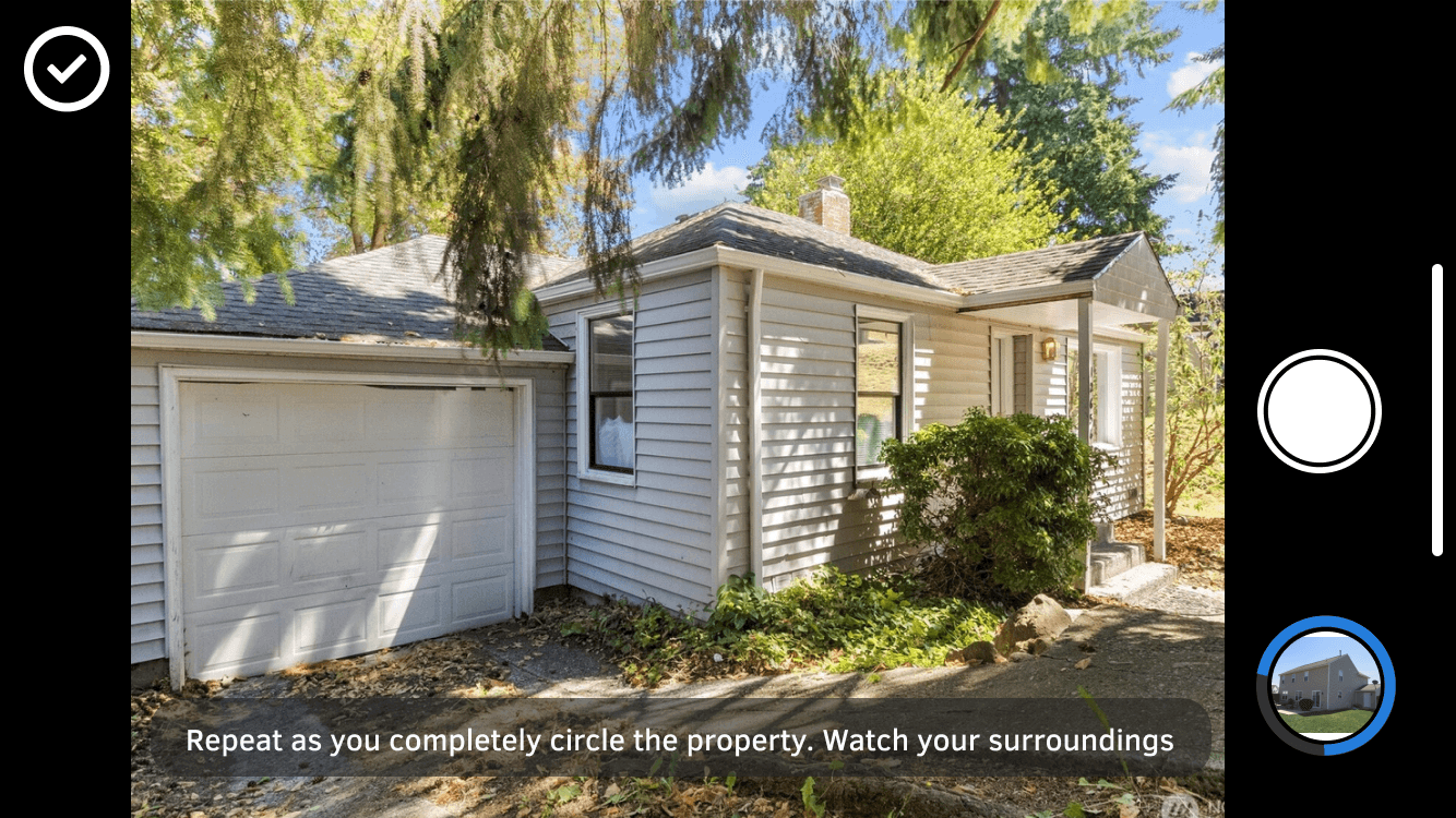
I also added a reminder after the second photo was taken to watch their surroundings, since staying safe while capturing was one of the problems that came out of research.
Confidence
To make people feel confident the app understood what it was seeing, I designed a post-snap AR effect that gave visible feedback that HOVER was intelligent and could read the scene.


04. Validation
Testing and Feedback
HOVER’s research team had a field trip to Maine planned for a different reason, so I joined them to test the new prototype with contractors and homeowners along the way. I had people try three versions: the original capture, the every-5-steps version, and the new overlap-based method. Almost everyone we talked to preferred the overlap-based method equal to or more than the original.


We saw a few positive themes.
Increased confidence
One contractor, a 6-year HOVER user, told us it was the best way he’d ever taken photos with the app.
“The old system, you didn’t have that confidence that you’re getting all the shots. This one, if you got any smarts about you at all, you can just figure it out that it’s wanting to get that overlap. You just have better confidence in knowing I got that shot.”
People took fewer photos than the every-5-steps version
“I like the overlap even a lot better than the 5-step because I’m lazy… I’m taking about half as many photos as I was trying to do every 5 steps.”
Better for handling obstructions
With the original capture, you had to photograph each corner and side specifically, which didn’t leave much room to work around something blocking the shot.
“Because of the additional pictures, if I have an obstruction, trees, cars, I have a better chance of getting a good view of the house…”
Testing also surfaced four distinct problems
(1) The pulsing button alone wasn’t a strong enough signal.
(2) The instructional text was too small, especially given how far the phone often sits from a user’s face during capture.
(3) Some users thought they had to snap the photo the moment the button started pulsing. In reality, the button could pulse after just one step, since the photos already overlapped, and it might still pulse after ten. Users had a wider window for taking the photo than they realized.
Iterating on Feedback
With those learnings, I added the words “overlap detected” to accompany the pulsing button for greater clarity. I also increased the text size. The pulsing button and label now appeared only after the user had moved a bit, so people took fewer near-identical photos.

With the beta deadline approaching, the researcher and I ran one more round of interviews. All 10 pro alpha users unanimously preferred the new overlap experience over both the original 8-grid capture and the every-5-steps version. We also interviewed 10 first-time homeowners on-site; 9 out of 10 rated the new experience higher.
“If you all go back to the other way, I’m canceling.”
“It is so simplistic, man, I literally couldn’t understand how somebody can’t use this.”
“This… however you guys did it, is way better. The other one (8-photo) was good but… (sighs)… It was more tedious.”
We tested the iterated build with the 40 alpha pros, and it scored 87 on UMUX-Lite, clearing our baseline of 84. That graduated us from alpha into Phase 1 of beta.
05. BETA
Beta Iterations
With the capture experience in a more solid place, I turned my attention to the moments in the flow before and after it.
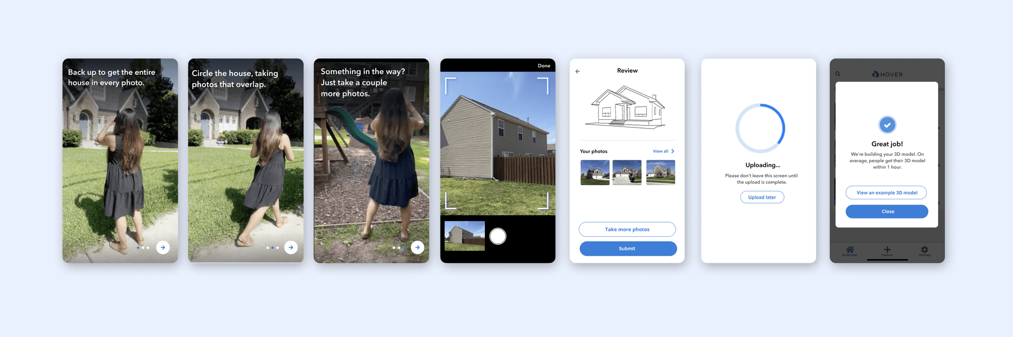
I directed first-time user instruction videos to replace the old illustrated panels.
My hypothesis was that videos would hold people's attention better than static images, and that watching a real person capture a home would help them understand the process. I also added a video showing how they could snap more photos even when there’s small obstructions in the way. These shipped about two weeks before I left, so I don’t have data on how people responded.
I also updated the post-capture flow. We added a sketch-like 3D preview before submission. We couldn't yet tell whether a capture would succeed, so the preview's job was to show users that HOVER understood what it was looking at. We removed the "Capture Summary" page, an extra step that wasn't addressing any meaningful user need. After users submit their photos, we introduced a confirmation message telling them most people receive their 3D model within an hour. Previously, first-time users had no idea what to expect next and when.
06. OUTCOMES
Beta Outcomes
I left while beta research was ongoing, but before that had the chance to talk to 6 pros.
All 6 pros I talked to in the beta cohort preferred the new capture experience over the original. We also ran a larger A/B test with 500 pros and 50% of all homeowners. Both groups rated the new experience higher, but the gain was much larger for pros than for homeowners.
Original capture: 86 (pros), 74 (homeowners)
New capture: 91.8 (pros), 75 (homeowners)
We also saw a 3.6% increase in capture uploads with the new experience, along with reduced drop-off.

However, there was still more to do as the fail rate also increased by 1.1%, meaning more captures weren’t able to deliver any measurements or 3D models. If I stayed longer, I would have focused on the following problems.
Improving the first-time user experience
Homeowners rated the new experience noticeably lower than pros. Homeowners usually only use HOVER once, while pros use it over and over and get more chances to figure it out. We could focus more on how we could improve the first-time user experience with better onboarding.
Reducing the failure rate
There were UX opportunities to explore for reducing failure, such as clearer guidance during capture. We wanted to experiment with the idea of detecting when the house is cropped in the camera frame, and nudging the user to back up to get as much of the house in the shot. There’s visual affordances that we started experimenting with.