
Company
Pano AI
Role
Design Systems Lead
Tech Stack
React, TypeScript, MUI
Tools
Figma, Claude Design
Timeline
07.2025 - ongoing
Overview
As design systems lead, I’ve done three things to keep design and code in sync:
01. Improved an existing design system: made Figma and code match on our first product
02. Built a new design system: created foundational tokens and components for an entirely new design system on a new platform
03. Enabled non-technical designers to prototype in code
PART 1: IMPROVING AN EXISTING SYSTEM
When I first stepped in, the design system in Figma was outdated and out of sync with production. Typography, colors, spacing, and components had all diverged over time.
"I don't trust the Figma components. They're either missing or inaccurate, so I have to check what's live and rebuild from scratch."
— Designer
In addition to that, the Figma file of the design system was disorganized, making it challenging to find the exact component needed.
"The specs I get from Figma, like colors and headings, have completely different names or values in code, so I constantly have to look things up."
— FE Engineer
This created confusion on both sides. Designers might use a component that didn't match production, and engineers couldn't tell if the mismatch was intentional or just outdated. This slowed things down for both teams and meant more back-and-forth during handoffs and QA.
PART 1: IMPROVING AN EXISTING SYSTEM
Plan and align
Before making any changes, I studied design systems across the industry to understand how other teams were solving the same problems. I looked at systems like Atlassian, Material Design, and Polaris, as well as community UI kits on Figma. I also pulled from online resources like DesignSystems.one, conference talks from Config, and documentation from teams like Spotify's design system. I took note of how they named colors, organized their file structures, and showcased component variants.
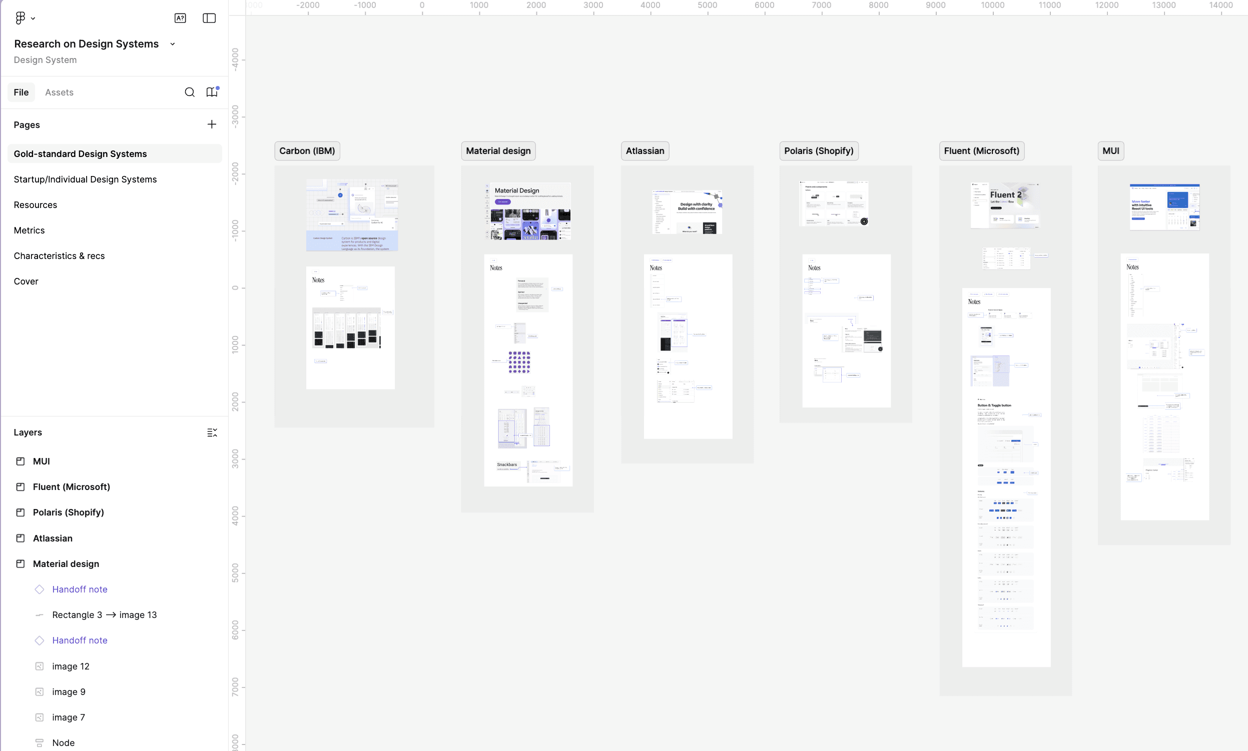
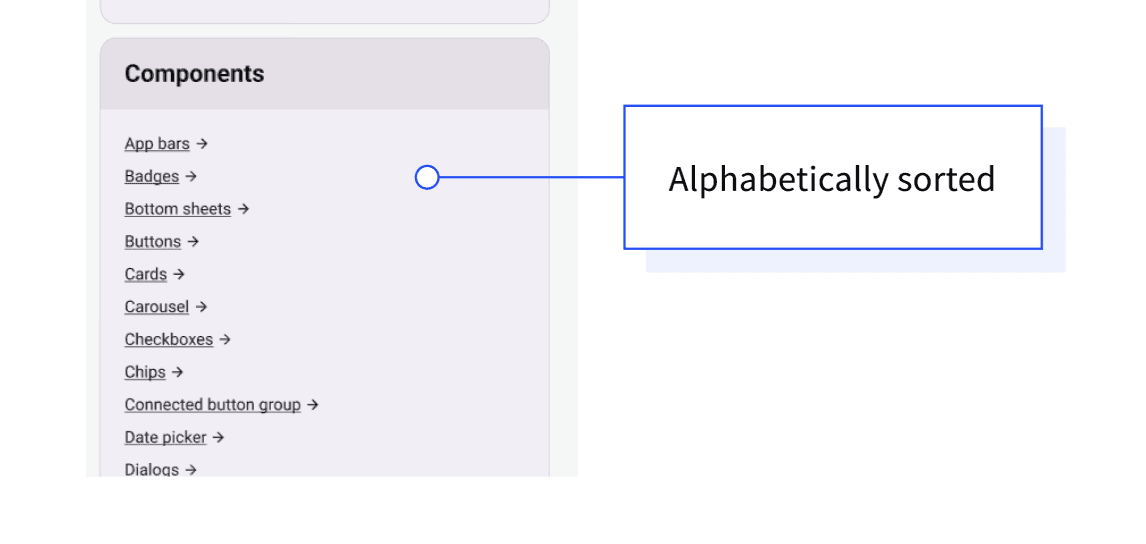
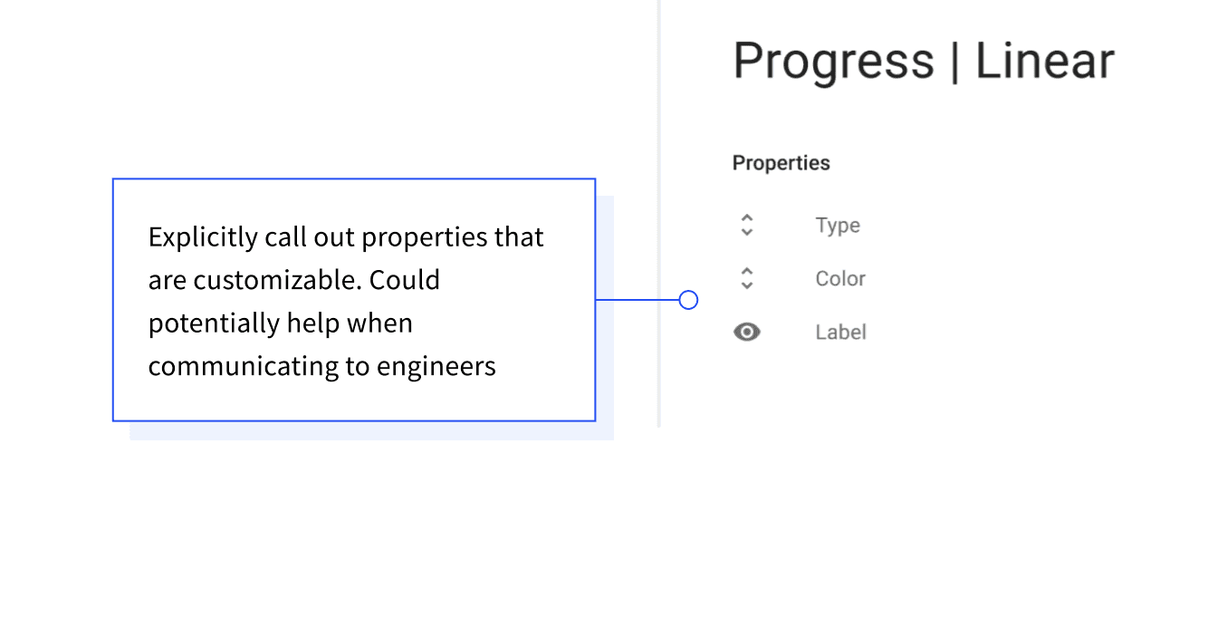
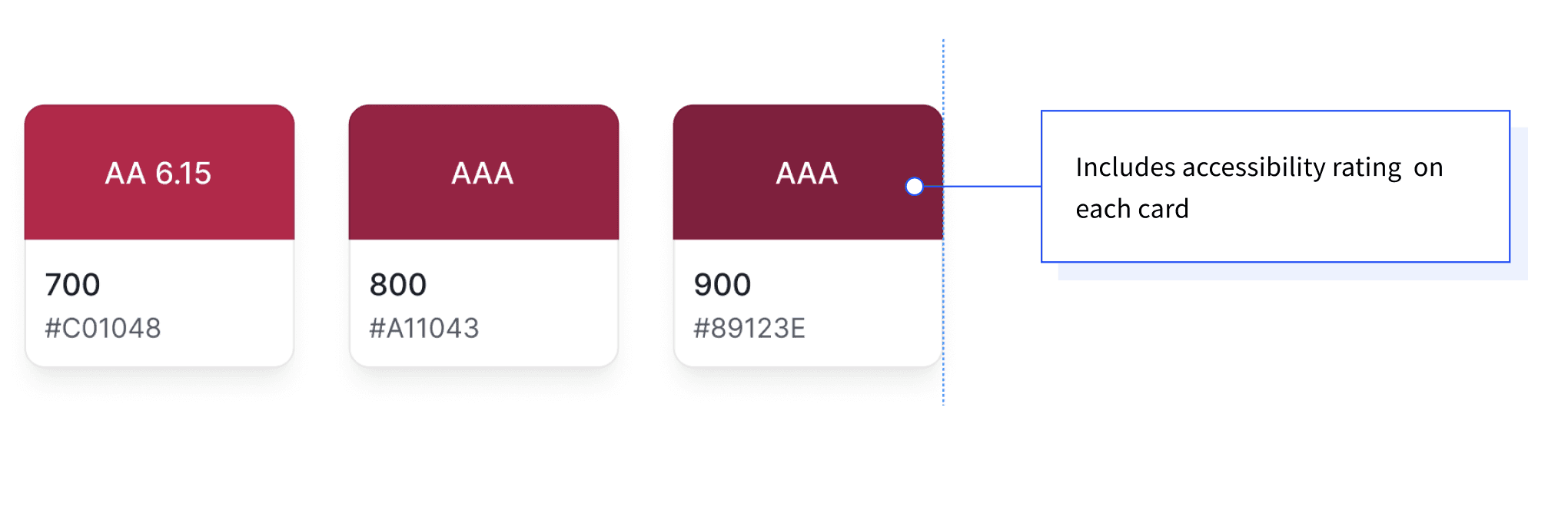
From there, I developed recommendations tailored to our team size and design system maturity. This included covering how to organize the Figma file, our implementation approach, and a strategy for what to tackle next. I then reviewed the plan with the design team to get alignment before we started.
Then I walked our front-end engineers through the plan.
We agreed to start with type, color and icons, then move on to components.
PART 1: IMPROVING AN EXISTING SYSTEM
Typography
The type styles in Figma didn't match what was in production. Heading sizes, line heights, paragraph spacing, and letter spacing were all different between design and code.
Example one: headings
Heading sizes and weights in Figma were completely different from what was in the codebase. For example, Figma's H1 was 40px semibold, while the code rendered H1 at 96px regular. H3 in Figma was 28px, a font-size that the codebase didn't even have. Figma had 5 headings, the code had 6.
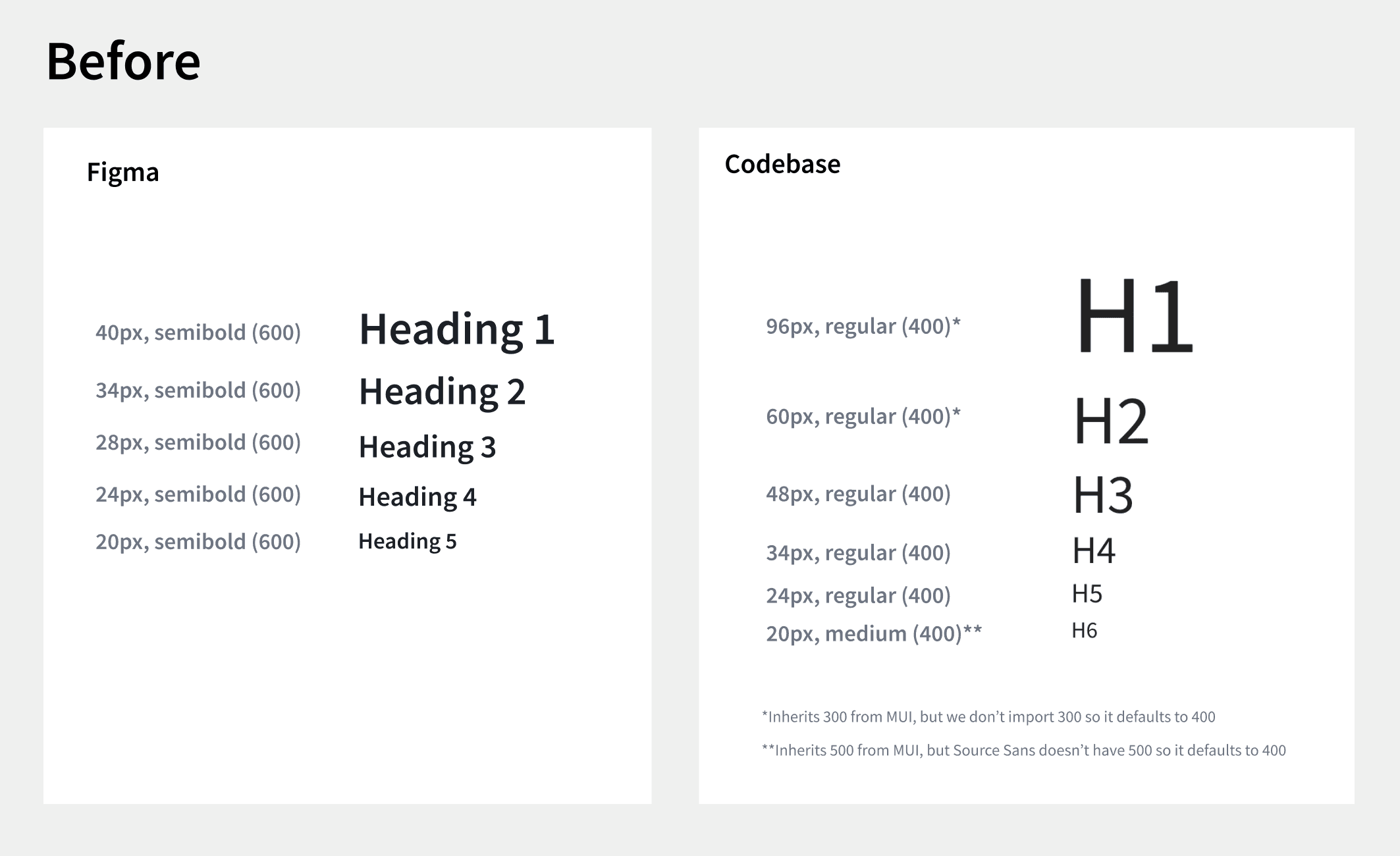
In addition, h5 and h6 in production had inconsistent font weights, with a mix of semibold and regular.
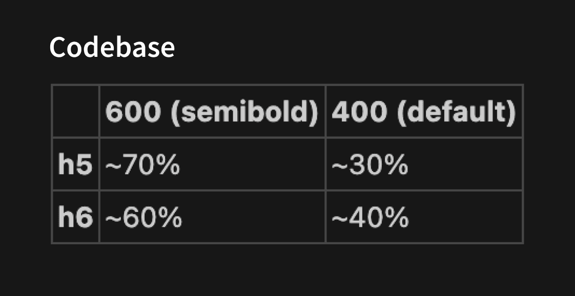
I did a visual audit and drove alignment with the design team to standardize on semibold for both h5 and h6. The team also aligned on matching Figma's heading font sizes to the codebase. I updated the type scale in Figma and changed the font-weight for h5 and h6 in code.
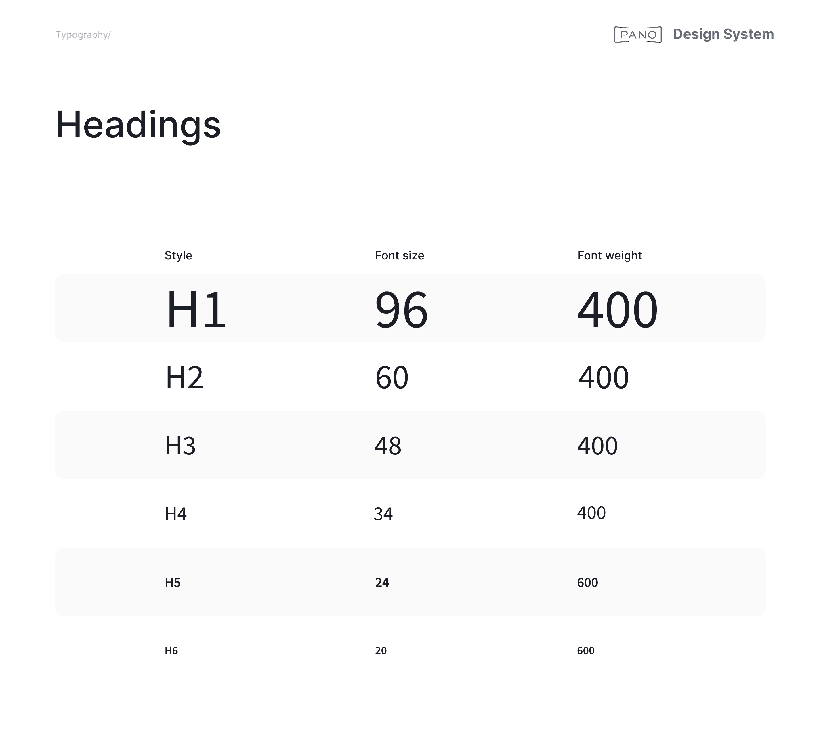
Now, heading styles are perfectly consistent across design and code.
Example two: paragraph spacing
Paragraph spacing in Figma didn't match what the code was rendering, so I updated it in Figma to align.
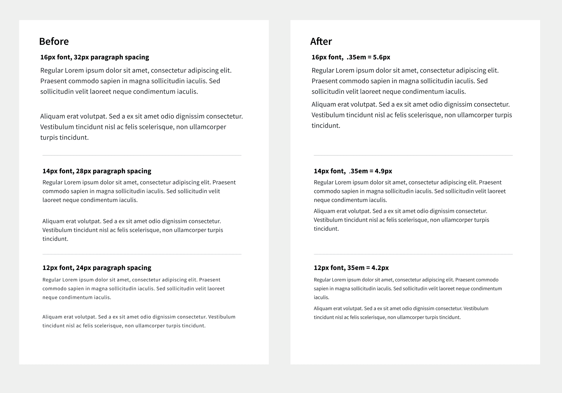
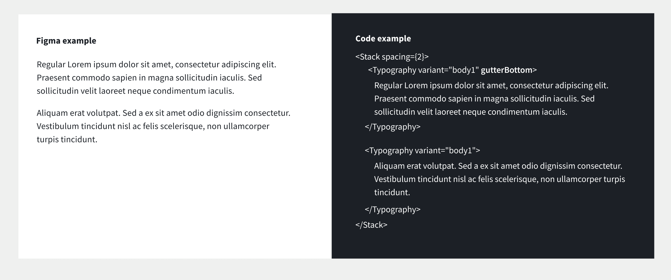
Now the paragraph spacing matches MUI's gutterBottom property.
PART 1: IMPROVING AN EXISTING SYSTEM
Colors
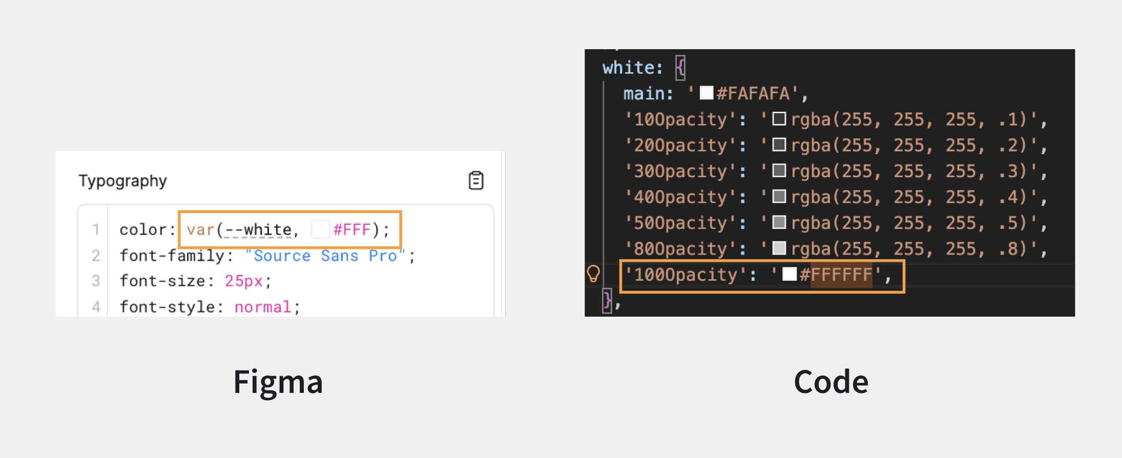
Color names in Figma and the codebase didn't match, and Figma was missing colors that existed in code.
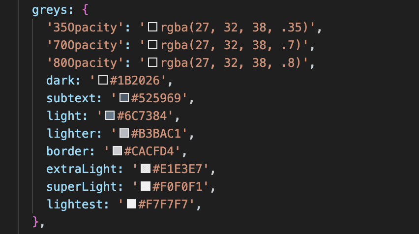
On the code side, naming was also inconsistent and unscalable.
I proposed a new color scale to designers and engineers, replacing custom names with a numbered system (e.g. gray.900, gray.800), keeping MUI's default variable names (e.g. primary.main, primary.dark). To get alignment, I put up a draft PR for engineers to give feedback on and shared updates in Figma for designers.
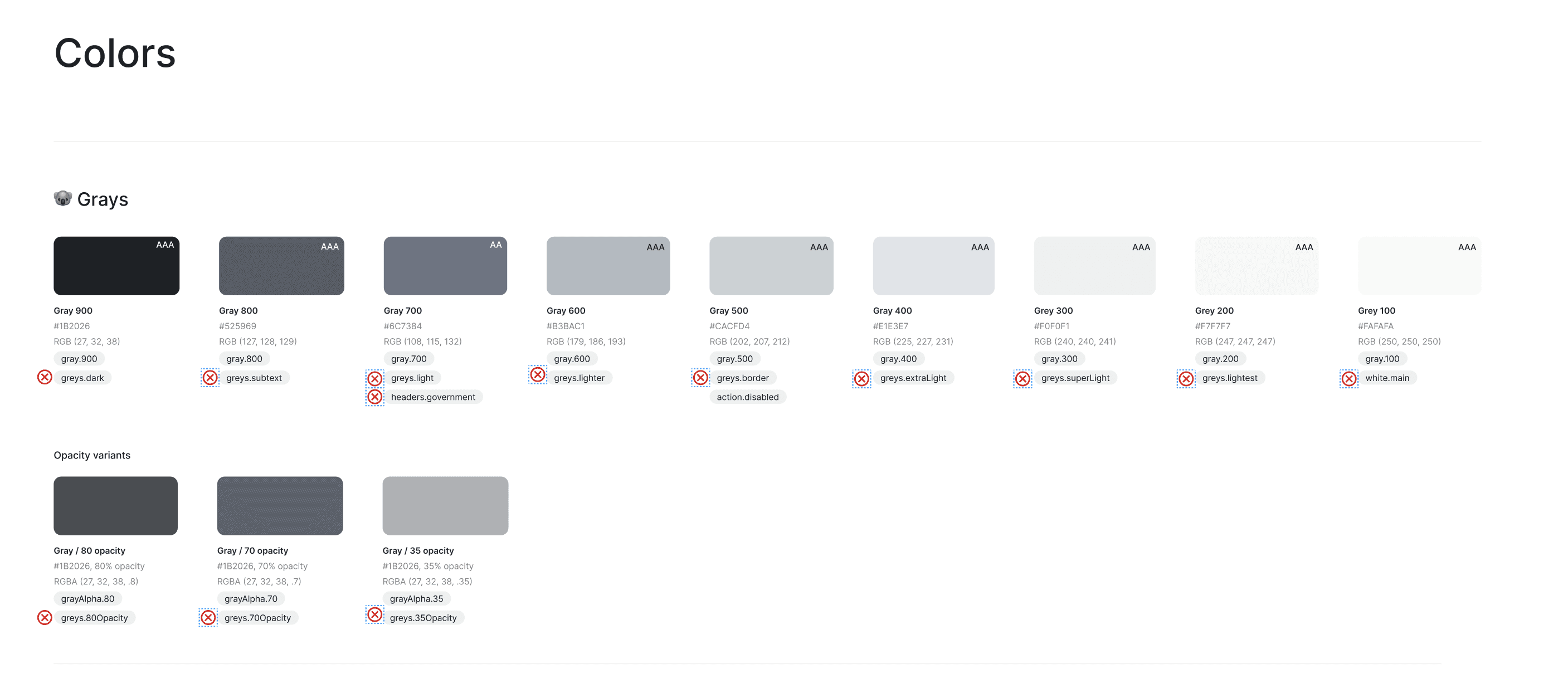
Then I migrated all the old color names in code, one color family at a time, each in its own PR.
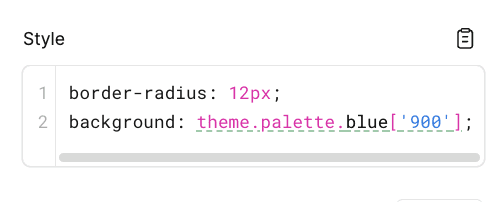
Now, the colors in the Figma and code are consistent. If a Figma component is inspected, it shows the same name as the code.
PART 1: IMPROVING AN EXISTING SYSTEM
Components
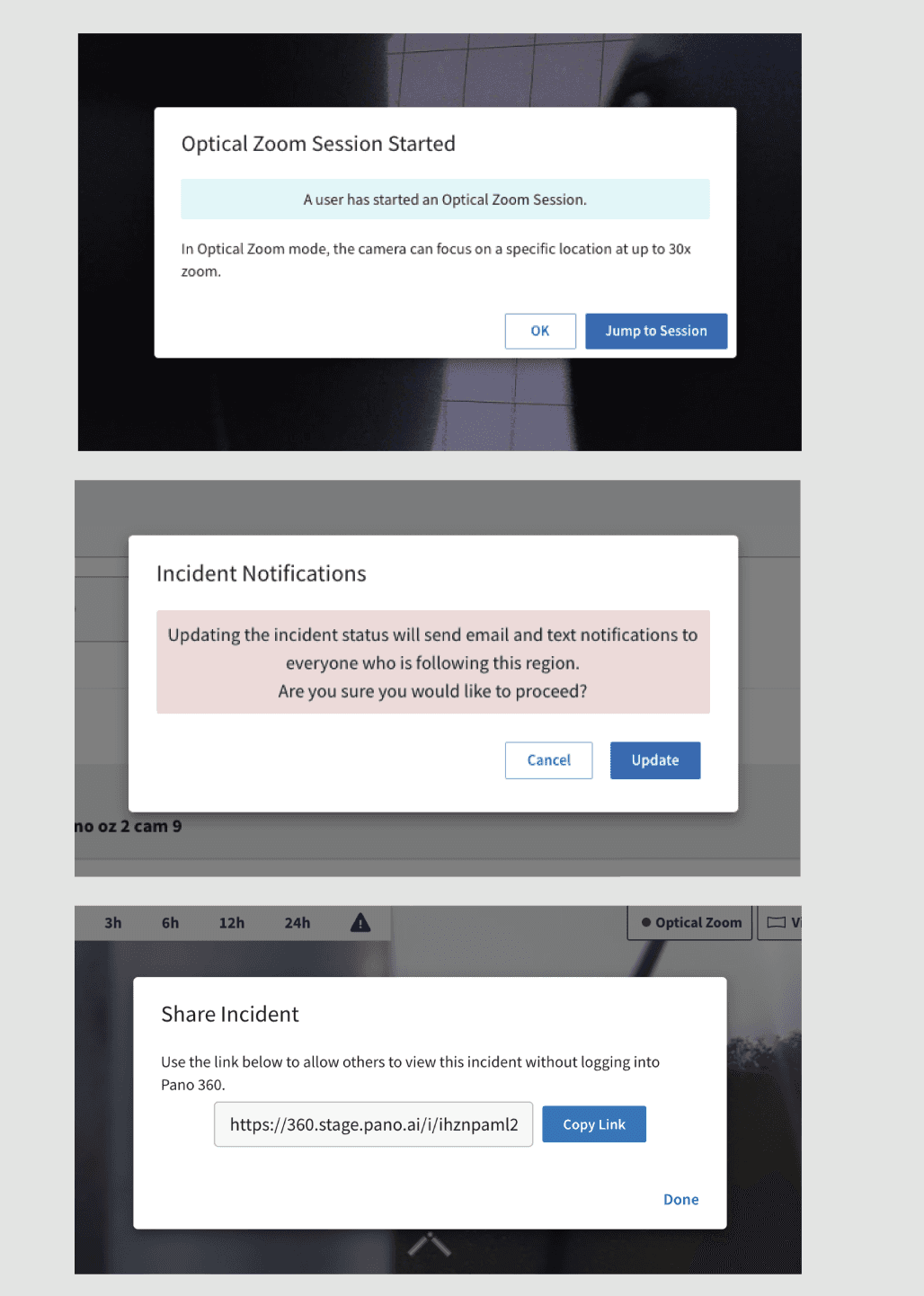
I also helped create consistent components in Figma and code. One example of that is the modal. Every modal in the app had different padding and margins, with things like awkwardly placed banners inside them.
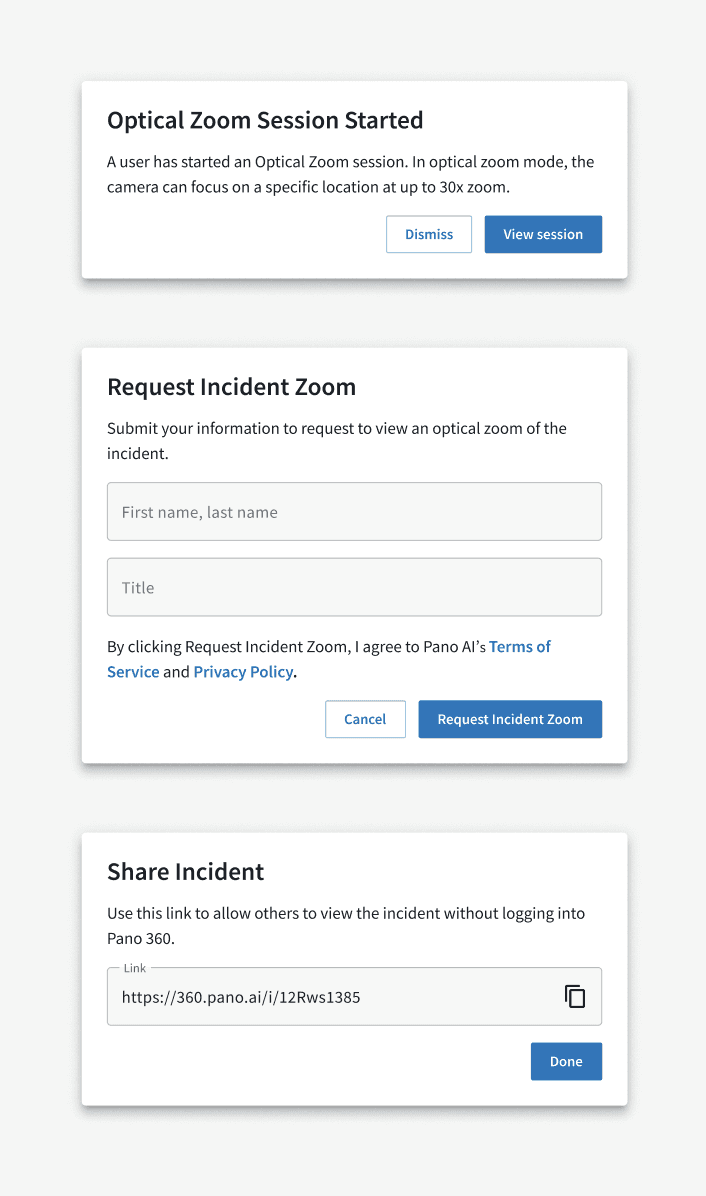
I designed and built a modal component in Figma and React and documented it in Storybook. It has standardized padding and margins, supports inputs, and allows for flexible button styling. I limited the size prop to the two sizes we actually needed, so nobody could set a one-off width. I also migrated the most-used modals in the codebase to use the new component.
PART 1: IMPROVING AN EXISTING SYSTEM
Icons in Figma were disorganized, with no clear system for variants or usage guidelines. The app also had a mix of outline (just the stroke) and filled (solid) icons with no consistency. I reorganized the icon library, defined variants for color, size, and type, and drove alignment with the design team on conventions, such as using outlined icons by default, and filled for their hover and active states.

PART 2
Building a new system
Components
I designed a set of components for the platform, starting with the basics: buttons, dropdowns, text fields and icon buttons, then a filter panel and snackbars.
Process
This is the process I used for creating a design system that grows alongside the product.

PART 3
Pilot
In our design team, I’m the one who tries out new AI tools and reports back! I first piloted “designing” in code on one project, adding a lightning map layer, where I could prototype things a Figma mock never could.
Using skills to enable designers
Prototyping that map layer made me want to enable our other designers to work this way too. None of our designers had a technical background, and most had never used Terminal or Git. I built skills that handle the parts of coding that trip designers up. Each skill is a command a designer can type, like /start, /new-project and /fix-me.
Before anyone used them, I talked to engineering leadership to check for any objections, then informed the engineering team designers would be working in the repo. I worked with IT to get every designer GitHub access, then I ran a workshop to help them set up their local environment and learn how to use the skills. In one afternoon, every designer had cloned the repo, got the app running locally, and could prototype in code.

Handoff to engineers
I built three skills for handoff. /handoff-code opens a draft PR with screenshots of the affected screens and sorts what changed from what’s new. The other two build annotated screens in Figma or on a Claude Design canvas, with pins for what changed, what stayed the same and what’s new.


Example Figma Handoff

Example Claude Design Handoff
Demo environment
I wanted a way to share coded prototypes with customers, with realistic mock data, so I pushed for a demo environment. To build a stronger business case, I found other teams who would benefit from it too, like sales, customer success and marketing. Then I talked with the head of Software Foundations, whose team had capacity to build the demo environment, and got him on board before I held a meeting with all the stakeholders. I found a PM who was willing to own it, and it’s now on the roadmap.
My vision
My vision is that a designer prototypes in code, hands it off easily, and engineers build from that code. Here's what that could look like:
Designers prototype in code
Customers try the prototype in a demo environment and give feedback
Designers hand off with comments and annotations right on the coded prototype
Either a skill splits the prototype into small tickets with specs, or engineers pull the relevant code from the prototype into their branch