Company
Pano AI
Role
Lead Product Designer
The team
1 designer, 1 FE engineer, 1 BE engineer, 1 Partnerships Manager, 1 PM, 1 QA engineer
Timeline
3 weeks, July 2026
01. Context
Lightning causes about 11% of wildfire ignitions in the US, but accounts for 53% of the acres burned. Strikes tend to land in remote, hard-to-reach terrain, sometimes hours from the nearest crew. In 2025 alone, fire agencies logged over 8,000 lightning-caused fires that burned nearly 2.9 million acres.
Lightning was Pano's most requested map layer for about a year across all our core user groups: utilities, forestry, dispatchers, and fire agencies.
"Whenever there is a lightning bust in the area, I will hop on our feeds to look for any possible incidents. l pull up Pano 360 on my desktop and have My Lightning Tracker on my phone, and use the feeds and lightning tracker together."
— Private Landowner
Before this layer, users tracked lightning in a separate tool and cross-referenced it against Pano.
"Having lightning data in Pano 360 would be great. There are several different lightning data resources, but having them in one place would be awesome, so they could cross-reference strikes with smoke plumes and get on them earlier."
— Texan Fire Agency
"We have a lightning storm through Arizona at the moment. If I was able to see lightning strike data in Pano on the map, I could easily match the visuals of the smoke to possible lightning strikes in the area."
— Arizonian Fire Agency
02. Research
To better understand how to build the lightning map layer, my PM and I talked to two customers and one internal subject matter expert, a former dispatcher, and dug into a repository of feedback shared with us by Customer Success. A few themes stood out:
Strike location accuracy
Users want to see exactly where each strike landed, including its coordinates.
Context on ignition cause
Seeing strikes near an existing Pano detection helps teams infer whether an incident was lightning-caused, which helps inform fire behavior, response strategy, and post-incident reviews.
Not all fires are immediate
In remote terrain, a lightning-ignited fire can smolder for hours or days before it's visible to cameras or satellites. Monitoring strikes a few days old is not unusual.
Strike characteristics carry different ignition risk
Age: Ignition risk tapers off gradually over hours and days. A strike is most likely to ignite a fire within its first hour, and the majority of lightning fires are detected within a day, but some smolder for longer before flaring up.
Polarity: Some customers tended to pay more attention to positive strikes as they're more likely to start a fire. Positive strikes tend to linger longer where they hit the ground, and that extra contact time can start a fire. But negative strikes shouldn't be written off either: they cause most lightning fires in the western US, simply because there are so many more of them.
Strong peak current: Strikes with higher amperage (~30kA and up) carry higher ignition risk.
Type: Cloud-to-ground strikes carry ignition risk, while cloud-to-cloud strikes can be ignored.
03. User problems
Although different customer types rely on the same strike data, they have different motivations.
Dispatch
As a dispatcher, I want to see recent lightning strikes so I can send resources to investigate possible fires.
Fire agencies
As a first responder, I want to see recent lightning strikes near a fire to confirm whether lightning caused it and anticipate other fires from the same storm that don't show up right away.
Utility operators
As a utility emergency operator, seeing recent lightning strikes helps me assess risk to our assets and prioritize response after a storm.
As a utility emergency operator, I'm often wondering if our own asset caused the fire, so this helps rule that out.
Forestry
As a forestry manager, I want to see recent lightning strikes across our land, so I can decide whether to send patrols to check it out.
04. Requirements
From the research, we decided to:
• Use a trusted data source, and filter out cloud-to-cloud strikes, since those never reach the ground and can't start a fire.
• Show strikes up to 72 hours old. Customers were no longer concerned about anything older, and a longer window would hurt map performance and add visual clutter.
• Provide key information about each strike, such as time of strike, polarity, coordinates, and peak current.
05. Competitive analysis
I looked at how existing apps display lightning and saw common patterns.
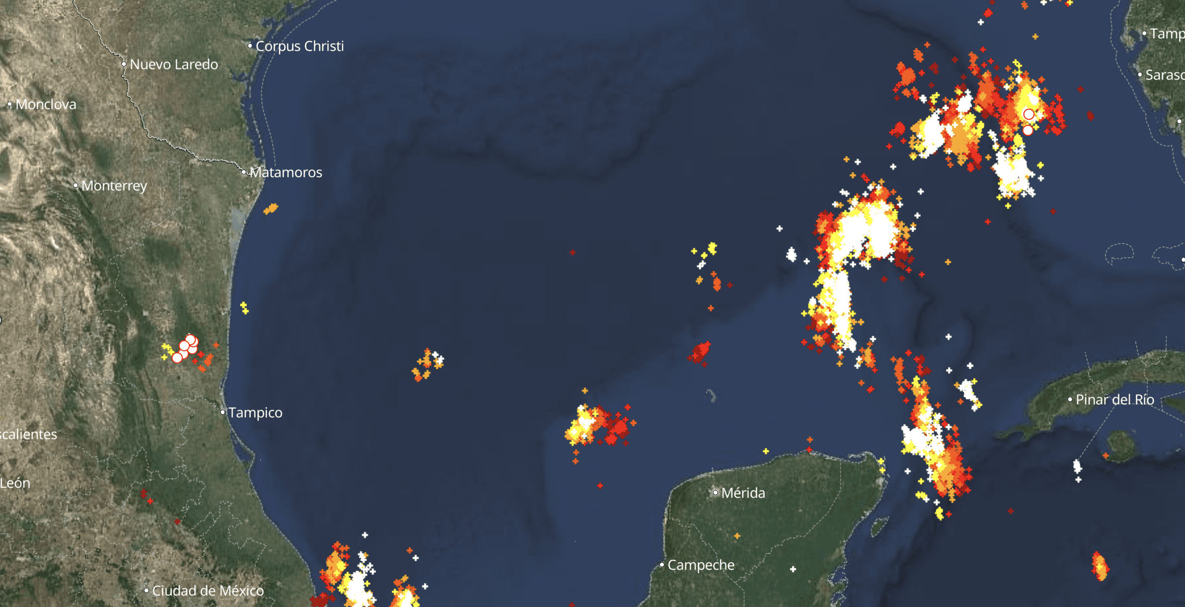


• Some had polarity indicators, like a plus or minus sign.
• Many showed recency using color.
• There could be hundreds of lightning strikes in one area. Some clustered when the map was zoomed out, while others didn't cluster at all.
• Some had an animation showing the order strikes landed in.
06. Design Process
07. Key Decisions
Recency
I used Claude Design to mock up different ways to show strike age, and landed on color since that's the standard pattern across lightning apps. I used a thermal scale, red being the most recent and blue-gray being the oldest. Other options I tried, like opacity fade or size, weren't great: fade was hard to see once dimmed, size read as too busy, and neither felt as intuitive as color.
Time intervals
Before shipping, I shared the prototype with two customers and internal subject matter experts. The pattern I saw was that the first hour matters most, then the rest of the first 24 hours, where customers wanted more granularity. After that first day, wider time buckets were fine. Because of that feedback, I went with the following time intervals, each mapped to a different color: 0-1 hours, 1-8 hours, 8-16 hours, 16-24 hours, 24-72 hours.
Circle icon vs individual strike
I was debating between two visual components and ran both by internal subject matter experts (former dispatcher and wildland firefighter) and a customer. Unanimously, they preferred the lightning strike visualization. I had thought they might like the circle icons more as they felt a bit easier to see, but the strike just felt more intuitive to them.
Clustering
I was against clustering strikes at first, since location accuracy was the top research finding and clustering hides exact points. But once I saw a single area with hundreds of strikes, the unclustered view was so noisy that it covered up the other map layers.
My PM and I first thought about clustering when there were ~40 nearby strikes. Prototyping in code showed me that Mapbox, our map library, had out-of-the-box clustering built on two things instead: how zoomed in the map is, and how close together strikes are on screen. So I decided to use those parameters because zoom-based clustering fit how users work. They care about their own territory, a county for agencies or a service area for utilities. Zoomed in on their territory, they want to check each strike. Zoomed far out, which isn't the common case, they just need to know strikes are happening there. Prototyping in code, I was able to test different zoom levels and strike proximity, which I would never have been able to do in Figma.
Filters
I tried different filter patterns in Claude Design first, then built out the filter interactions (polarity, minimum peak current, and time) in the React prototype. Only time would make it into scope, but I wanted to see how different filters would scale. Originally I was thinking of filtering in a way that aligned with the time intervals. However, from feedback, every customer wanted something slightly different (e.g., 1-6 hours vs. 12-24 hours), so we decided to give them flexibility with this slider that lets them specify the time range they want.
08. Final designs
In addition to filtering and clustering, the final design included a popover with strike information upon clicking on it and an explanation in the legend.
09.Collaboration and handoff
Throughout the process, I had weekly design reviews with my team. I had to edit components in Figma because I wanted to map out flows and specify certain details which I couldn't do in the prototype. Since then, I've made a skill that looks at what changed in the code and automatically adds those screens to Figma with annotations.
After the project, because this was a new process of designing in code, I checked in with the frontend engineer and asked if the draft PR was helpful or not, with the goal of getting transparent feedback.
They didn't end up copying code directly (the way the ticket-based workflow splits up implementation made building the code themselves from scratch more practical), but the prototype removed doubt and served as a working reference.
She said, "It just erases any doubt that the desired outcome is possible. Initially I couldn't get the cluster icon to look the way it does in the Figma, so I checked your code to see how you'd achieved it, and that was a super quick solution, rather than me searching around or going back to you and being like 'it's not possible.'"
Release and impact
The layer shipped behind a feature flag, releasing internally then beta-ing with select customers for a week before GA.
[add metrics]
We also got a lot of positive feedback from cutomers.
"As a utility, this feature is important because lightning likes to hit tall things, we use it every day. I like the color coding. I think I'll keep the layer on permanently" — Utility Manager
"Positive strikes almost always create more issues on the electric grid and wildfires, so the plus or minus icon is excellent. The signal on strong strikes near our assets is of particular interest." — Utility Director
One customer shared the following screenshot and reported, "Had a fire locally this weekend that was likely lightning caused. Nice to see the proximity between strike and fire…"

What's next
Ways I think we can continue to improve lightning:
• More fine-tuned filtering, including polarity and peak current, so users can narrow down to just the strikes they want to check.
• Storing strike history long enough to play back an incident. That way, users can replay a strike landing, followed by the smoke detection. That direct visual link would make it much easier to tell whether a fire was lightning-caused, instead of inferring it after the fact.
• Users have also asked for the Pano camera to zoom in on a strike so they can check to see if a fire is there or smoldering is occurring.
Learnings and reflections
Protoyping in Code
Prototyping in code allowed me to test things a static mock never would have, like how clustering really behaves, where the zoom cutoffs land, and times when the code did something different than I expected. Because it was so helpful, so I wanted other designers to be able to do it too. Many designers don't know how to code, so I built skills that let them prototype in code. You can read more about that here.
The Future of Design
If engineering gives AI enough guardrails, and at the pace AI is improving, I wouldn't be surprised if it becomes a more mainstream practice for designers, even non-technical ones, to ship code. There would be a blurrier line between where a designer's job ends and an engineer's begins. I've seen companies limit designers to small changes, like a single line of code or only pure UI polish. Our engineering team is already reviewing more PRs than they used to because of AI, and designers shipping code would add to that. I worry about how engineers will feel about that, as I've seen some engineering coworkers and friends embrace using AI in their workflows, while others feel like it's stealing the fun part of their jobs. Despite the tradeoffs, it is empowering to be able to bring my ideas to life seamlessly with AI.